Can this help with my lead?
Potential friction. A feature list can obscure whether the task is supported.
Design response. Lead with the investigation job; expose deeper comparison when needed.
BLOCKCHAIN INTELLIGENCE · PRODUCT STRATEGY
As QLUE Express’s sole designer, I shaped the product experience and the plans that determined how people could access it.
End-to-end design, from feature-to-plan mapping to a self-service route into blockchain investigation.
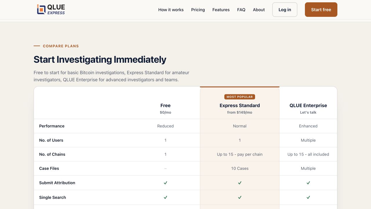
An urgent investigation loses momentum when buying access and understanding the tool become separate projects.
Make access understandable enough that an investigator can choose an appropriate plan and move toward tracing a lead.
A useful business hypothesis is that a clear self-service path can turn existing investigative intent into qualified product usage. The relevant conversion is not merely account creation: it is a person successfully completing a meaningful investigation action. Revenue and retention depend on that distinction.
MY CONTRIBUTION
I was the sole designer on QLUE Express. My responsibility included product packaging and feature allocation, alongside the interface design. The current public screens illustrate the product today; they are not a versioned record of my original release.
I was the sole designer and owned the plans and feature allocation. The research account describes why I emphasized the graph. Screenshots show the current public product; process maps are retrospective reconstructions. The survey result is explained separately from the website decisions.
Customer research and commercial feedback shaped the graph-led website. The task model that follows adds retrospective hypotheses for further testing.
RESEARCH → DESIGN DECISION
I combined customer interviews, sales feedback, usage data, and competitor research to understand how different audiences evaluated QLUE.
Law-enforcement officers needed the graph above the other modules. It was the capability they valued most.
I made the graph central to the QLUE Express website’s product story and organized plans around different categories of users.
The design connected the graph’s value with a plan structure that explained how different audiences could access its capabilities.
This is my retrospective account of the research and design decision. It does not establish a measured conversion change from the graph-led presentation.
| Who the experience serves | What they need |
|---|---|
| Law-enforcement investigator | Understand and access the graph—the module prioritized in my research account. |
| Independent investigator | Evaluate a lead quickly and understand whether the available capabilities fit the case. |
| Small investigation team | Understand access and limitations before committing time and budget. |
| Product and commercial teams | Connect entry-level adoption with an appropriate path to deeper usage. |
Potential friction. A feature list can obscure whether the task is supported.
Design response. Lead with the investigation job; expose deeper comparison when needed.
Potential friction. A commercial restriction may feel like a broken search.
Design response. Make capabilities and chain coverage explicit before commitment.
Potential friction. More graph detail can make the evidence harder to interpret.
Design response. Keep the source lead visible and distinguish data from inference.
An independent investigator arrives with an address or transaction and wants to decide whether to examine it further.
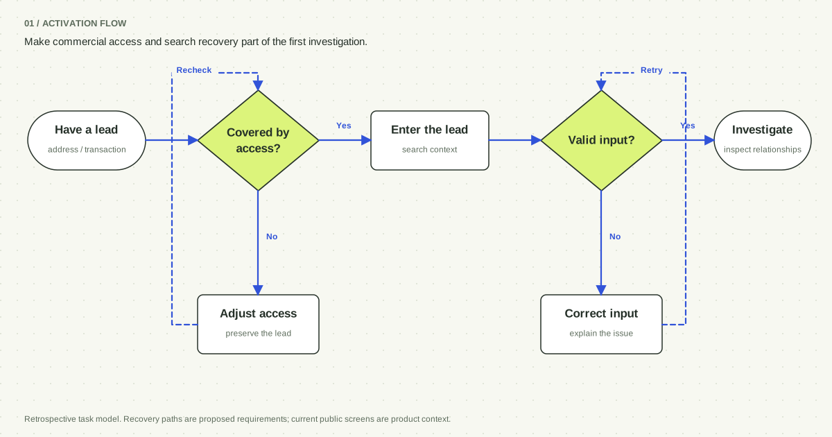
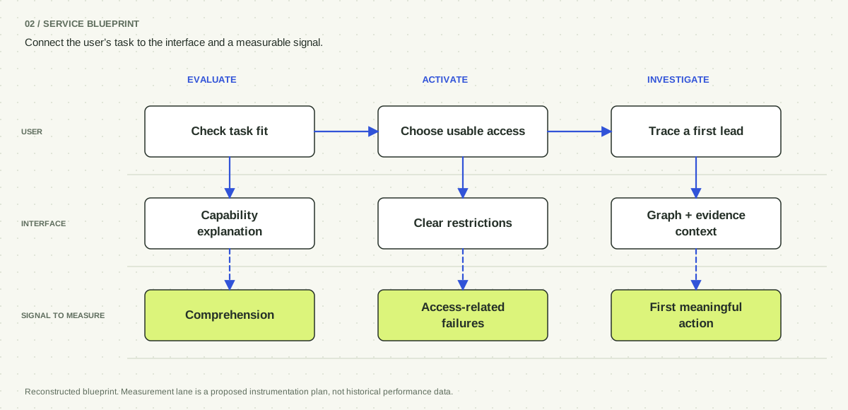
Explain the specific restriction, preserve the lead, and offer a deliberate access decision. Proposed recovery requirement.
Distinguish invalid input, unsupported coverage, and absent data. Avoid treating all three as an empty graph. Proposed recovery requirement.
Proposed activation flow, synthesized from the public product model. Account internals and the historical implementation were not inspected.
Explore the key screens, interaction states, and decisions behind them.
PRODUCT JOURNEY / CURRENT PUBLIC SCREENS
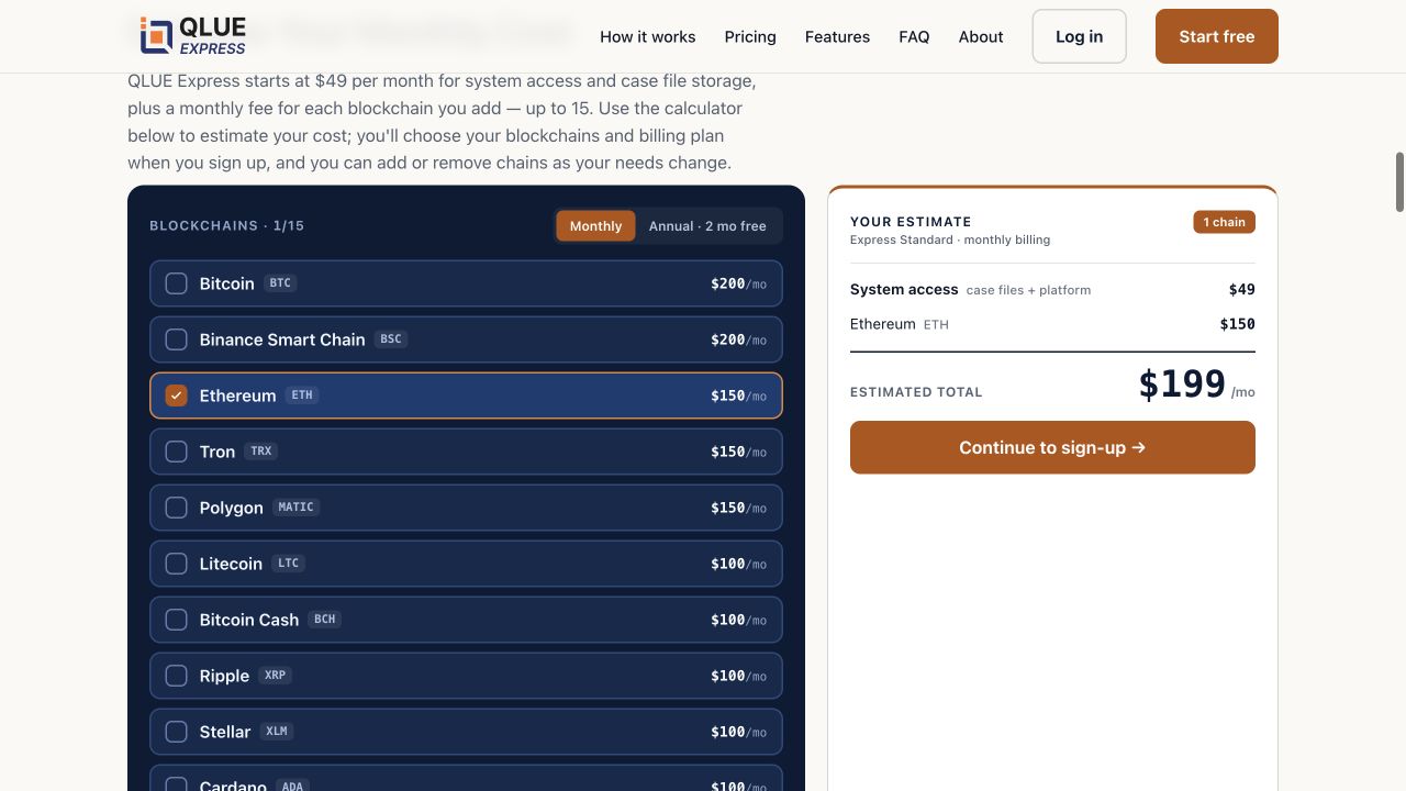
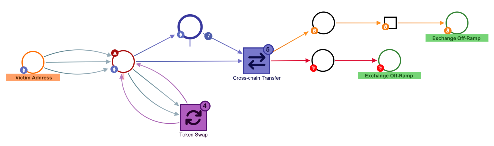
Law-enforcement users prioritized the graph. I brought that capability forward in the website and mapped features to plans for different audiences. These current public screens illustrate the two connected decisions: choosing access and following evidence.
Self-service removes a conversation that could otherwise help a novice choose. Contextual guidance must carry that explanation without slowing experienced investigators.
These are two stages of the public product, not historical before-and-after screens or proof of conversion uplift.
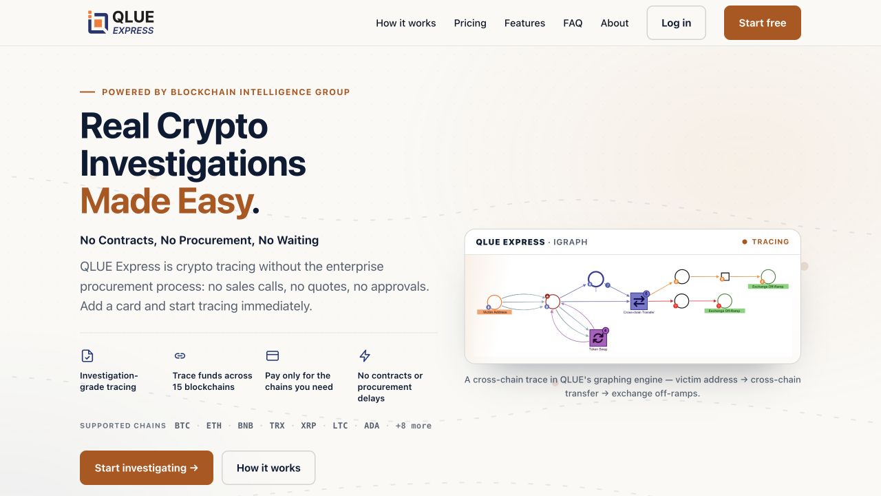
The investigation promise precedes the comparison of capabilities.
The graph shows the kind of work the entry route leads toward.
Design evidence, the reasoning it supports, and the tradeoffs that remain.
In the design. Customer interviews, sales feedback, usage data, and competitor research informed my work. I learned that law-enforcement officers valued the graph above the other modules, so I emphasized it in the QLUE Express website.
The website needed to communicate the capability users valued most. Leading with the graph connected the product story to their investigative work.
Giving the graph greater prominence meant other modules could not receive equal attention at entry. The plan and feature structure still needed to communicate what each audience could access.
In the design. I created the product plans for different categories of users and determined which features belonged in each plan. This feature-to-plan mapping was part of my responsibility as the sole designer.
A new user needs a predictable relationship between the access they choose and the actions they can perform. Otherwise a restriction encountered mid-task can look like a product failure.
More configuration can improve fit but adds decisions. Explain boundaries near the choice and preserve a straightforward starting route.
In the design. The published graph example connects an originating address, intermediate activity, and destinations.
Relationships are the substance of an investigation. A visual representation can support orientation, while detailed inspection must preserve the underlying evidence and uncertainty.
A graph can become visually dense. Progressive expansion and contextual information are useful design directions; they should not be presented as historically tested decisions without the original records.
Retrospective option analysis; these are tradeoffs for review, not claims that every option was tested.
Value. Supports tailored qualification and complex procurement.
Tradeoff. Leaves smaller, immediate needs dependent on a human buying process.
Value. Maximizes initial capability visibility.
Tradeoff. Can increase decision load and obscure the first useful action.
Value. Connects a clear task with a lower-friction starting route.
Tradeoff. Requires careful capability boundaries, education, and upgrade continuity.
A retrospective validation plan would follow the complete activation funnel. Compare similarly qualified cohorts and separate acquisition changes from interface changes. Instrument restrictions, unsuccessful searches, and requests for help so a completed registration does not hide a failed first session.
Proposed task-based scenarios for validation.
| Scenario | What to observe | How the result informs design |
|---|---|---|
| Choose access for a lead on a specified chain. | Whether the user can predict coverage and limitations before entering the tool. | Clarify capability language if users confidently choose unsuitable access. |
| Reach the first meaningful tracing action. | Hesitation, input errors, help requests, and time excluding idle periods. | Fix the largest first-use failure before adding acquisition traffic. |
| Encounter an unavailable capability mid-task. | Whether the user understands the restriction and can retain the lead. | Prioritize contextual recovery if the task is abandoned or restarted. |
Eligible new accounts completing the agreed first tracing task ÷ eligible new accounts.
Tests whether the entry flow produces usable access.
Median elapsed time from account entry to that task, with idle sessions reported separately.
Tests whether users can reach useful work efficiently.
Activated users returning to investigation activity in a defined follow-up window.
Distinguishes initial curiosity from recurring product value.
I owned QLUE Express’s design from ideation through production, including the plans and feature allocation. The current public product provides context for that work. Project-specific activation, retention, and revenue results are not available; the wider résumé result is explained separately below.
The most compelling story is the connection between business model and first-use design: making a powerful capability available is only valuable when the right user can reach a useful result.
Work covered. Product design and senior product design roles · 2021–2024. These are role dates, not measurement windows.
Reported measures. My résumé reports a 65% improvement in customer satisfaction. I tracked satisfaction through regular surveys and saw it rise after the release of a widely requested feature I worked on. Microsoft Clarity supplied behavioral insights; the satisfaction feedback came from surveys.
How to interpret them. The feature and survey series are not identified in this public account. The starting score, final score, sample size, question wording, and measurement window are not available here. The résumé’s reported improvement should not be read as a final satisfaction score or a percentage-point change, or attributed to the graph-led website alone.
Source: my résumé ↗I was the sole designer and owned the plans and feature allocation. The research account describes why I emphasized the graph. Screenshots show the current public product; process maps are retrospective reconstructions. The survey result is explained separately from the website decisions.